Prior to Android "L" preview, the easiest way to setup tabs with Fragments was to use ActionBar Tabs as described in ActionBar Tabs with Fragments guide. However, all methods related to navigation modes in the ActionBar class (such as setNavigationMode(), addTab(), selectTab(), etc.) are now deprecated.
As a result, tabs are now best implemented by leveraging the ViewPager with a custom "tab indicator" on top. In this guide, we will be using the PagerSlidingTabStrip to produce tabbed navigation within our app.
Note: Want to avoid using a third-party library for tabs? Check out how to build sliding tabs using Google's TabLayout approach.
First, we need to add PagerSlidingTabStrip to our application by adding the following to our app/build.gradle file:
dependencies {
    implementation 'com.astuetz:pagerslidingtabstrip:1.0.1'
}
Once you have included the library and synced with Gradle, we can use the PagerSlidingTabStrip in our layout file to display tabs. Your layout file will have tabs on the top and a ViewPager on the bottom as shown in the code snippet below:
<?xml version="1.0" encoding="utf-8"?>
<LinearLayout
    xmlns:android="http://schemas.android.com/apk/res/android"
    xmlns:tools="http://schemas.android.com/tools"
    android:layout_width="match_parent"
    android:layout_height="match_parent"
    android:orientation="vertical"
    tools:context=".MainActivity">

    <com.astuetz.PagerSlidingTabStrip
        android:id="@+id/tabs"
        android:layout_width="match_parent"
        android:layout_height="48dip" />

    <android.support.v4.view.ViewPager
        android:id="@+id/viewPager"
        android:layout_width="match_parent"
        android:layout_height="match_parent"
        android:layout_below="@+id/tabs">
    </android.support.v4.view.ViewPager>

</LinearLayout>
Make sure to add the xmlns:app namespace as shown above to your root layout.
Now that we have the ViewPager and our tabs in our layout, we should start defining the content of each of the tabs. Since each tab is just a fragment being displayed, we need to create and define the Fragment to be shown. You may have one or more fragments in your application depending on your requirements.
In res/layout/fragment_page.xml define the XML layout for the fragment which will be displayed on screen when a particular tab is selected:
<?xml version="1.0" encoding="utf-8"?>
<!-- This is the fragment  to be displayed for a section associated with a tab -->
<LinearLayout xmlns:android="http://schemas.android.com/apk/res/android"
android:orientation="vertical" android:layout_width="match_parent"
android:layout_height="match_parent">
<TextView
    android:id="@+id/tvTitle"
    android:text="Fragment #X"
    android:layout_width="match_parent"
    android:layout_height="match_parent"
    android:gravity="center" />
</LinearLayout>
In PageFragment.java define the inflation logic for the fragment section of tab content:
// In this case, the fragment displays simple text based on the page
public class PageFragment extends Fragment {
    public static final String ARG_PAGE = "ARG_PAGE";

    private int mPage;

    public static PageFragment newInstance(int page) {
        Bundle args = new Bundle();
        args.putInt(ARG_PAGE, page);
        PageFragment fragment = new PageFragment();
        fragment.setArguments(args);
        return fragment;
    }

    @Override
    public void onCreate(Bundle savedInstanceState) {
        super.onCreate(savedInstanceState);
        mPage = getArguments().getInt(ARG_PAGE);
    }

    // Inflate the fragment layout we defined above for this fragment
    // Set the associated text for the title
    @Override
    public View onCreateView(LayoutInflater inflater, ViewGroup container, Bundle savedInstanceState) {
        View view = inflater.inflate(R.layout.fragment_page, container, false);
        TextView tvTitle = (TextView) view.findViewById(R.id.tvTitle);
        tvTitle.setText("Fragment #" + mPage);
        return view;
    }
}
You would need to do redo this process for each section you want to have a tab for in your activity.
The next thing to do is to implement the adapter for your ViewPager which controls the order of the tabs, the titles and their associated content. The most important methods to implement here are getPageTitle(int position) which is used to get the title for each tab and getItem(int position) which determines the fragment for each tab.
public class SampleFragmentPagerAdapter extends FragmentPagerAdapter {
    final int PAGE_COUNT = 3;
    private String tabTitles[] = new String[] { "Tab1", "Tab2", "Tab3" };

    public SampleFragmentPagerAdapter(FragmentManager fm) {
        super(fm);
    }

    @Override
    public int getCount() {
        return PAGE_COUNT;
    }

    @Override
    public Fragment getItem(int position) {
        return PageFragment.newInstance(position + 1);
    }

    @Override
    public CharSequence getPageTitle(int position) {
        // Generate title based on item position
        return tabTitles[position];
    }
}
Read the ViewPager and FragmentPagerAdapter for additional details.
Finally, we need to attach our ViewPager to the SampleFragmentPagerAdapter and then configure the sliding tabs with a two step process:
onCreate() method of your activity, find the ViewPager and connect the adapter.ViewPager on the PagerSlidingTabStrip to connect the pager with the tabs.public class MainActivity extends AppCompatActivity {
@Override
protected void onCreate(Bundle savedInstanceState) {
super.onCreate(savedInstanceState);
setContentView(R.layout.activity_main);
// Get the ViewPager and set it's PagerAdapter so that it can display items
ViewPager viewPager = (ViewPager) findViewById(R.id.viewPager);
viewPager.setAdapter(new SampleFragmentPagerAdapter(getSupportFragmentManager()));
// Give the PagerSlidingTabStrip the ViewPager
PagerSlidingTabStrip tabsStrip = (PagerSlidingTabStrip) findViewById(R.id.tabs);
// Attach the view pager to the tab strip
tabsStrip.setViewPager(viewPager);
}
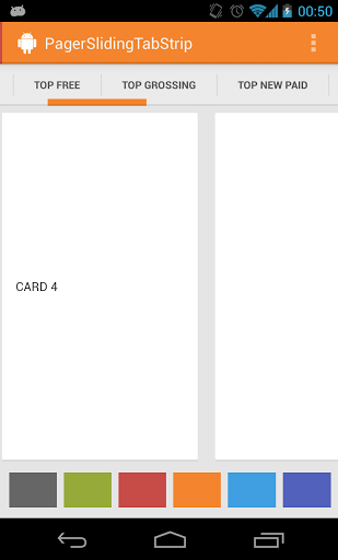
}Heres the output:

Read the ViewPager and FragmentPagerAdapter for additional details such as how to access and modify the current selected tab.
If the Activity needs to be able listen for changes to the page selected or other events surrounding the ViewPager, then we just need to hook into the ViewPager.OnPageChangeListener on the PagerSlidingTabStrip to handle the events:
// Attach the page change listener to tab strip and **not** the view pager inside the activity
tabsStrip.setOnPageChangeListener(new OnPageChangeListener() {

	// This method will be invoked when a new page becomes selected.
	@Override
	public void onPageSelected(int position) {
		Toast.makeText(HomeActivity.this,
                    "Selected page position: " + position, Toast.LENGTH_SHORT).show();
	}

	// This method will be invoked when the current page is scrolled
	@Override
	public void onPageScrolled(int position, float positionOffset, int positionOffsetPixels) {
		// Code goes here
	}

	// Called when the scroll state changes:
	// SCROLL_STATE_IDLE, SCROLL_STATE_DRAGGING, SCROLL_STATE_SETTLING
	@Override
	public void onPageScrollStateChanged(int state) {
		// Code goes here
	}
});
Now we can programmatically handle page changes as they are applied.
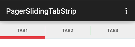
You can change the style of the tabs by adding any of the following properties to the tab strip in the layout XML:
<com.astuetz.PagerSlidingTabStrip
    android:id="@+id/tabs"
    app:pstsShouldExpand="true"
    android:layout_width="match_parent"
    android:layout_height="48dp"
    android:textSize="14sp"
    android:textColor="#000000"
    app:pstsDividerColor="@color/green"
    app:pstsIndicatorColor="@color/red"
    app:pstsUnderlineColor="@color/blue"
    app:pstsTabPaddingLeftRight="14dp">
</com.astuetz.PagerSlidingTabStrip>
and the result of this is:
In addition to the above, there are several other attributes that can be set:
pstsIndicatorHeightHeight of the sliding indicatorpstsUnderlineHeight Height of the full-width line on the bottom of the viewpstsDividerPadding Top and bottom padding of the dividerspstsScrollOffset Scroll offset of the selected tabpstsTabBackground Background drawable of each tab, should be a StateListDrawablepstsShouldExpand If set to true, each tab is given the same weight, default falsepstsTextAllCaps If true, all tab titles will be upper case, default truetextSize If set, it will use this value for the tab text style (default = 12sp).textColor If set, it will use the color specified here.All attributes have their respective getters and setters so they can be changed at runtime.
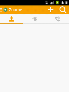
We can add icons instead of text to each our tabs by implementing the IconTabProvider interface within our pager adapter:
public class SampleFragmentPagerAdapter extends FragmentPagerAdapter implements IconTabProvider {
    final int PAGE_COUNT = 3;
    private int tabIcons[] = {R.drawable.ic_tab_one, R.drawable.ic_tab_two, R.drawable.ic_tab_three}

    public SampleFragmentPagerAdapter(FragmentManager fm) {
        super(fm);
    }

    @Override
    public int getCount() {
        return PAGE_COUNT;
    }

    @Override
    public Fragment getItem(int position) {
        return PageFragment.newInstance(position + 1);
    }

    @Override
    public int getPageIconResId(int position) {
        return tabIcons[position];
    }
}
And the result is:
The individual tabs in the sliding tab strip can be accessed at runtime with:
PagerSlidingTabStrip tabStrip = (PagerSlidingTabStrip)findViewById(R.id.tabs);
LinearLayout view = (LinearLayout) tabStrip.getChildAt(0);
TextView textView = (TextView) view.getChildAt(2);
textView.setText("Mentions (2)");
With this we can update the text for the tab to display update indicators or other changes as the app receives data.
If you need further customization of your ViewPager tabs such as completely custom tab design, check out Google's TabLayout approach or this alternative third-party library SmartTabLayout.
