A drawable resource is a general concept for a graphic that can be drawn to the screen. Drawables are used to define shapes, colors, borders, gradients, etc. which can then be applied to views within an Activity.
This is typically used for customizing the view graphics that are displayed within a particular view or context. Drawables tend to be defined in XML and can then be applied to a view via XML or Java.
For a list of the default drawables for every version of Android, see the androiddrawables site as an excellent reference.
Drawables can be an initially overwhelming topic because there are many drawable types used in different situations such as drawing shapes, setting state behaviors for buttons, creating stretchable button backgrounds and creating compound drawable layers.
There are at least 17 types of drawables but there are five that are most important to understand:
Let's explore these drawable file types one by one and take a look at examples of usage.
The Shape Drawable is an XML file that defines a geometric shape, including colors and gradients. This is used to create a complex shape that can then be attached as the background of a layout or a view on screen. For example, you can use a shape drawable to change the shape, border, and gradient of a button background.
A shape is simply a collection of properties that are combined to describe a background. The shape can be described with properties such as corners for rounding, gradient for backgrounds, padding for spacing, solid for background colors, and stroke for border.
Here's an example of drawing a rounded rectangle with a border in res/layout/drawable/solid_color_shape.xml:
<?xml version="1.0" encoding="utf-8"?>
<shape xmlns:android="http://schemas.android.com/apk/res/android"
    android:shape="rectangle" >
    <corners android:radius="4dp" />
    <stroke android:width="4dp" android:color="#C1E1A6" />
    <solid android:color="#118C4E"/>
    <padding android:left="20dp" android:top="20dp"
             android:right="20dp" android:bottom="20dp" />
</shape>
and then applied to a TextView using the background property:
<TextView
android:layout_width="wrap_content"
android:layout_height="wrap_content"
android:background="@drawable/solid_color_shape"
android:textColor="#ffffff"
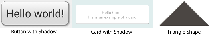
android:text="@string/hello_world" />and the resulting view looks like:

Note that drawables can be applied to any view and are usually set with the background property referencing the drawable resource.
Shapes also support gradients backgrounds as well as supporting properties such as startColor, centerColor, endColor, angle. Different gradients such as radial, linear or sweep can be selected using the type property.
Here's an example of a simple linear gradient shape specified in res/layout/drawable/gradient_shape.xml:
<?xml version="1.0" encoding="utf-8"?>
<shape xmlns:android="http://schemas.android.com/apk/res/android"
    android:shape="rectangle" >
    <corners android:radius="4dp" />
    <stroke android:width="1dp" android:color="#0078a5" />
    <gradient
        android:startColor="#0078a5" android:endColor="#00adee"
        android:angle="90"/>
    <padding android:left="8dp" android:top="2dp"
             android:right="8dp" android:bottom="2dp" />
</shape>
applied to a button and the resulting view looks like:

You can also setup radial-type gradients with:
<?xml version="1.0" encoding="utf-8"?>
<shape xmlns:android="http://schemas.android.com/apk/res/android"
    android:shape="rectangle" >
    <corners android:radius="4dp" />
    <stroke android:width="4dp" android:color="#CCFFFF" />
    <gradient
        android:startColor="#0078a5"
        android:endColor="#CCFFFF"
        android:gradientRadius="250"
        android:type="radial"
        />
    <padding android:left="30dp" android:top="30dp"
             android:right="30dp" android:bottom="30dp" />
</shape>
and applied to a TextView, this looks like:

Using solid color shapes and gradients we can customize the appearance of buttons, layouts and other views without requiring the use of any images. Note that custom shapes can be created at runtime using other shape drawable types using PathShape and ArcShape.
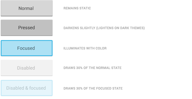
A StateListDrawable is a drawable object defined in XML that uses several different images to represent the same graphic, depending on the state of the object. For example, a Button widget can exist in one of several different states (pressed, focused, or neither) and, using a state list drawable, you can provide a different background image for each state. The state list supports different view states such as android:state_pressed, android:state_focused, android:state_enabled, android:state_selected, among many others. The illustration below shows all the major states that can be represented:
For example, a state list XML for a button background might look like the following in a file such as res/drawable/selector_button_bg:
<?xml version="1.0" encoding="utf-8"?>
<selector xmlns:android="http://schemas.android.com/apk/res/android">
    <item
        android:state_pressed="true"
        android:state_enabled="true"
        android:drawable="@drawable/button_pressed" />
    <item
        android:state_focused="true"
        android:state_enabled="true"
        android:drawable="@drawable/button_focused" />
    <item
        android:state_enabled="true"
        android:drawable="@drawable/button_enabled" />
</selector>
Now, when the view (i.e button) is pressed or focused, the drawable used for the view will change accordingly. Note that any view can have a state selector, but the most common uses are with buttons and listview items. There are also color state selectors which allow a color to be chosen based on view state such as in a file named res/color/button_text.xml:
<?xml version="1.0" encoding="utf-8"?>
<selector xmlns:android="http://schemas.android.com/apk/res/android">
    <item android:state_pressed="true" android:color="#ffff0000"/>
    <item android:state_focused="true" android:color="#ff0000ff"/>
    <item android:color="#ff000000"/>
</selector>
and applied to any field that accepts a color value such as the textColor property of a button in a layout file:
<Button
    android:layout_width="fill_parent"
    android:layout_height="wrap_content"
    android:text="@string/button_text"
    android:textColor="@color/button_text" />
Using state lists allows us to easily define dynamic views that respond to pressed, checked, enabled or other related states.
A LayerDrawable is a drawable object that manages an array of other drawables. Each drawable in the list is drawn in the order of the list—the last drawable in the list is drawn on top. Each drawable is represented by an <item> element inside a single <layer-list> element.
The LayerList can be used to draw multiple other drawables (shapes, images, etc) and position them in relationship to one another. The layers are placed on top of one another by default with the last item being drawn on the top. Layers can then have their coordinates shifted using the left, right, top, and bottom properties.
Common use cases for layer lists include:
For a simple example, the following layer list draws several shapes in relation to each other:
<?xml version="1.0" encoding="utf-8"?>
<layer-list xmlns:android="http://schemas.android.com/apk/res/android" >
    <item>
      <shape
        android:shape="rectangle">
            <size android:width="280dp" android:height="140dp"/>
            <stroke android:width="1dp" android:color="#585858" />
            <solid android:color="#FF9009" />
            <padding android:bottom="1dp"/>
        </shape>
   </item>
   <item android:left="10dp" android:top="20dp" android:bottom="20dp" android:right="150dp">
      <shape
        android:shape="oval">
            <stroke android:width="1dp" android:color="#ffffff" />
            <solid android:color="#118C4E" />
            <padding android:bottom="1dp"/>
        </shape>
   </item>
   <item android:left="150dp" android:top="20dp" android:bottom="20dp" android:right="10dp">
      <shape
        android:shape="rectangle">
            <stroke android:width="1dp" android:color="#ffffff" />
            <solid android:color="#C1E1A6" />
            <padding android:bottom="1dp"/>
        </shape>
   </item>
</layer-list>
and this results in the following:

Keep in mind that the items in a LayerList can also be images or any other type of drawable. You can use this to create more complex drawings and overlay multiple drawables on top of each other. See more examples within the official docs.
A NinePatch is a PNG image in which you can define stretchable regions that are stretched when the content within the View exceeds the normal image bounds. You typically assign this type of image as the background of a View which has its width set to wrap_content. The most common use is a button that has to stretch based on the text displayed inside.
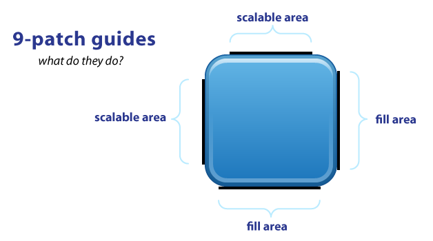
NinePatch are images that have a .9.png file extension, which signifies that this is a stretchable PNG image. The file is no different from a normal PNG file except that you will add thin black lines to indicate the vertical and horizontal "stretchable" and "fill" areas for the image. Android will not show these guide lines, which are used to determine how the image should be rendered.
An example of a 9-patch image is embedded below (left is the 9patch graphic, right is an example of use in an app):


A NinePatch is defined and saved in the drawable folder and setting the background works the same as with any image:
<Button android:layout_width="wrap_content"
        android:layout_height="wrap_content"
        android:text="Submit"
android:background="@drawable/button_background"/>.9.png extension in the drawable folder, and the 9-patch editor will display instead of the normal image editor. You can use the mouse to select the regions to be stretched (use Shift and click while dragging the mouse to erase the region), and the preview pane on the right displays how images will be rendered depending on the text inside.

The left and top lines need to be defined for the stretchable regions. To avoid stretching the arrow of this speech bubble in the above example, we define regions outside this area. The right and bottom lines define where text can be filled. Without the bottom line for instance, your text will not fill up the entire width of the stretched region and may not be centered properly.
You can also use the draw9patch tool to create special nine-patch images or you can use the online 9-patch utility. You can check out great ready-made examples of pretty 9-patch buttons for examples.
See this simple guide for more information. You can also refer to the official nine-patch docs.
These are XML drawables that can define complex vector-based images which can scale to support all densities automatically. This means using vector-based images, you will need only one asset file as opposed to an asset file for each screen density in the case of bitmap images.
First, see the setup guide to enable support for vector drawables for pre-Lollipop devices.
To create a vector image, you need to define pathData syntax which is located here. This example defines the details of the shape inside a XML element such as res/drawable/ic_heart.xml with:
<!-- res/drawable/ic_heart.xml -->
<vector xmlns:android="http://schemas.android.com/apk/res/android"
    android:height="256dp"
    android:width="256dp"
    android:viewportWidth="32"
    android:viewportHeight="32">
  <!-- draw a path -->
  <path android:fillColor="#c9c10606"
      android:pathData="M20.5,9.5
                        c-1.955,0,-3.83,1.268,-4.5,3
                        c-0.67,-1.732,-2.547,-3,-4.5,-3
                        C8.957,9.5,7,11.432,7,14
                        c0,3.53,3.793,6.257,9,11.5
                        c5.207,-5.242,9,-7.97,9,-11.5
                        C25,11.432,23.043,9.5,20.5,9.5z" />
</vector>We can then load vectors using the app:srcCompat property:
<?xml version="1.0" encoding="utf-8"?>
<RelativeLayout xmlns:android="http://schemas.android.com/apk/res/android"
    xmlns:app="http://schemas.android.com/apk/res-auto">
    <ImageView
      android:layout_width="wrap_content"
      android:layout_height="wrap_content"
      app:srcCompat="@drawable/ic_heart" />
</RelativeLayout>Note: Be sure to use app:srcCompat to support older Android devices. If you use android:src for a vector drawable, your app may render correctly in newer devices but may crash in pre-Lollipop devices.
This results in the following image being rendered:

You can also set a vector at runtime using:
ImageView iv = (ImageView) findViewById(...);
iv.setImageResource(R.drawable.ic_heart);
Be sure to check out this great age of vectors blog post for a more detailed look at vectors. Also see the official release blog post for additional compatibility notes and this video talk.
Vector drawables can now be found directly within Android Studio and also on many Android resource websites. Assuming you have updated to Android Studio v2.2, you can check for vector drawables inside the File => New => Vector Asset wizard:


You can find additional icons on the material design icons website which includes community-contributed icons as well.

Learn more about finding icons here for use within your app.
In addition, there are several ways to create vector drawables directly from SVG graphics:
You can refer to this VectorDrawables guide for more details.
Let's take a look at an end-to-end example of customizing a button using drawables to govern the styling and the pressed states.
Creating a custom button require combining at least a state list drawable with a shape drawable. First, let's create our shape drawable which represents the "default" button background in res/drawable/nice_button_enabled.xml:
<?xml version="1.0" encoding="utf-8"?>
<shape xmlns:android="http://schemas.android.com/apk/res/android" android:shape="rectangle">
    <gradient
        android:startColor="#0078a5"
        android:endColor="#00adee"
        android:angle="90"/>
    <padding android:left="15dp"
        android:top="1dp"
        android:right="15dp"
        android:bottom="1dp" />
    <stroke
        android:width="1dp"
        android:color="#0076a3" />
    <corners android:radius="8dp" />
</shape>
Let's also create a style (set of view properties) that includes setting the background in res/values/styles.xml:
<style name="NiceButton" parent="@android:style/Widget.Button">
    <item name="android:gravity">center_vertical|center_horizontal</item>
    <item name="android:textColor">#FFFFFF</item>
    <item name="android:background">@drawable/nice_button_enabled</item>
    <item name="android:textSize">16sp</item>
    <item name="android:textStyle">bold</item>
    <item name="android:focusable">true</item>
    <item name="android:clickable">true</item>
</style>
This now represents the shape and background of the button in the default state along with all the other properties. We could apply this by setting the style of the button:
<Button
    android:id="@+id/btnGo"
    style="@style/NiceButton"
    android:layout_width="wrap_content"
    android:layout_height="wrap_content"
/>
If we run that, we will see the following button:

Now the button shows up nicely but doesn't have any "pressed" or "focused" states. To do this, we need to create a State List drawable that describes the drawables for each state in res/drawable/states_nice_button.xml:
<?xml version="1.0" encoding="utf-8"?>
<selector xmlns:android="http://schemas.android.com/apk/res/android">
    <item
        android:state_pressed="true"
        android:state_enabled="true"
        android:drawable="@drawable/nice_button_pressed" />
    <item
        android:state_focused="true"
        android:state_enabled="true"
        android:drawable="@drawable/nice_button_focused" />
    <item
        android:state_enabled="true"
        android:drawable="@drawable/nice_button_enabled" />
</selector>
This describes the look of the button in all three major states (default, pressed and focused). Now we need to create two more Shape drawable states. One for res/drawable/nice_button_pressed.xml and another for res/drawable/nice_button_focused.xml:
<?xml version="1.0" encoding="utf-8"?>
<shape xmlns:android="http://schemas.android.com/apk/res/android" android:shape="rectangle">
    <gradient
        android:startColor="#00adee"
        android:endColor="#0078a5"
        android:angle="90"/>
    <padding android:left="15dp"
        android:top="1dp"
        android:right="15dp"
        android:bottom="1dp" />
    <stroke
        android:width="1dp"
        android:color="#0076a3" />
    <corners android:radius="8dp" />
</shape>
For this guide the pressed and focused states will appear the same but of course these could be distinct visual states as well. Now, we need to change the style to use the res/drawable/states_nice_button.xml:
<style name="NiceButton" parent="@android:style/Widget.Button">
    <item name="android:gravity">center_vertical|center_horizontal</item>
    <item name="android:textColor">#FFFFFF</item>
    <item name="android:background">@drawable/states_nice_button</item>
    <item name="android:textSize">16sp</item>
    <item name="android:textStyle">bold</item>
    <item name="android:focusable">true</item>
    <item name="android:clickable">true</item>
</style>
Now we have a button that has a nice shape drawable background and changes visual state when pressed all without requiring a single image asset! Be sure to check out the Button Generator for a tool that allows you to make your own buttons via a web interface.
Another common task is customizing the appearance of items in a ListView. First let's create the basic ListView and populate String items inside. First, the layout XML for the item in res/layout/item_simple.xml:
<?xml version="1.0" encoding="utf-8"?>
<TextView xmlns:android="http://schemas.android.com/apk/res/android"
    android:id="@android:id/text1"
    android:layout_width="match_parent"
    android:layout_height="wrap_content"
    android:gravity="center_vertical"
    android:padding="5dp"
    android:text="Large Text"
    android:textAppearance="?android:attr/textAppearanceLarge" />
Next, let's setup the basic ListView xml in an activity:
<ListView
       android:id="@+id/lvTest"
       android:layout_width="match_parent"
       android:layout_height="wrap_content">
</ListView>
and then populate the ListView with items:
ArrayList<String> items = new ArrayList<String>();
for (int i = 1; i < 8; i++) {
items.add("Item " + i);
}
ArrayAdapter<String> aItems = new ArrayAdapter<String>(this, R.layout.item_simple, items);
lvTest = (ListView) findViewById(R.id.lvTest);
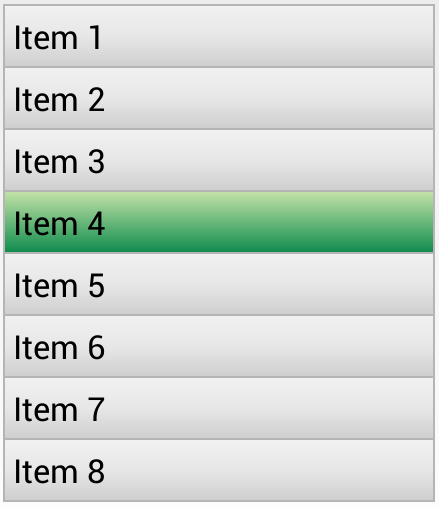
lvTest.setAdapter(aItems);This results in the following default styles ListView:

Now, let's add our own styling to the ListView. Let's add a default gradient and a pressed gradient, change the divider color between items and add a border around the ListView. First, let's add the shape gradient background for the default state in res/drawable/gradient_bg.xml:
<?xml version="1.0" encoding="utf-8"?>
<shape xmlns:android="http://schemas.android.com/apk/res/android"
    android:shape="rectangle">
  <gradient
      android:startColor="#f1f1f2"
      android:centerColor="#e7e7e8"
      android:endColor="#cfcfcf"
      android:angle="270" />
</shape>
and then for the pressed gradient background in res/drawable/gradient_pressed_bg.xml:
<?xml version="1.0" encoding="utf-8"?>
<shape xmlns:android="http://schemas.android.com/apk/res/android"
    android:shape="rectangle">
  <gradient
      android:startColor="#C1E1A6"
      android:endColor="#118C4E"
      android:angle="270" />
</shape>
and then let's create a state list which describes the drawables to use in various list states in res/drawable/states_selector_list.xml:
<?xml version="1.0" encoding="utf-8"?>
<selector xmlns:android="http://schemas.android.com/apk/res/android">
    <item
        android:state_selected="false"
        android:state_pressed="false"
        android:drawable="@drawable/gradient_bg" />

    <item android:state_pressed="true"
          android:drawable="@drawable/gradient_pressed_bg" />

    <item android:state_selected="true"
          android:state_pressed="false"
          android:drawable="@drawable/gradient_pressed_bg" />
</selector>
Next, let's setup the border for our ListView using a Shape drawable in res/drawable/list_border.xml by setting the "stroke" property:
<?xml version="1.0" encoding="utf-8"?>
<shape xmlns:android="http://schemas.android.com/apk/res/android" android:shape="rectangle" >
    <stroke android:width="1dp" android:color="#b5b5b5" />
    <solid android:color="#00000000" />
</shape>
Let's now apply each of these XML drawables to the various elements. First, let's add the background to the list item itself and tweak res/layout/item_simple.xml:
<TextView xmlns:android="http://schemas.android.com/apk/res/android"
    ...
    android:background="@drawable/states_selector_list" />
Notice that the background property has been set to the states list in order to apply the default background for the item. Next, let's add the border and the selector states to the existing ListView in the activity layout file:
<ListView
   ...
   android:padding="1dp"
   android:divider="#b5b5b5"
   android:dividerHeight="1dp"
   android:background="@drawable/list_border"
   android:listSelector="@drawable/states_selector_list" >
</ListView>
Here we have customized the divider color and dividerHeight as well as the background to apply the border and listSelector to manage the states when an item is pressed. With all this in place, our customized ListView now looks like:
We've now successfully customized the appearance of our ListView and it's items using a series of drawables. You can use these techniques to make a list look however you want based on the needs for your app.
We can access drawables at runtime within our Java code by accessing the background of a view that has the drawable applied. For example, given this layer list at res/drawables/message_bubble.xml:
<?xml version="1.0" encoding="utf-8"?>
<layer-list xmlns:android="http://schemas.android.com/apk/res/android" >
    <item android:id="@+id/outerRectangle">
        <shape android:shape="rectangle" >
            <solid android:color="#FF00FF" />
        </shape>
    </item>
    <item android:left="10dp">
        <shape android:shape="rectangle" >
            <solid android:color="#ffccd2" />
        </shape>
    </item>
</layer-list>
We can then access the outerRectangle by the specified id from within our activity:
// Get drawable layer list from the background
LayerDrawable bubble = (LayerDrawable) tvFoo.getBackground();
// Access
GradientDrawable outerRect = (GradientDrawable)
  bubble.findDrawableByLayerId(R.id.outerRectangle);
// Change the solid color of the drawable
outerRect.setColor(Color.parseColor("#2f8f22"));
Note that the shape is accessed as a GradientDrawable here even though the shape is a solid color.
If you are using vector drawables or animated vector drawables at runtime for pre-Lollipop devices, make sure to use the new AppCompatResource class instead of the normal getDrawable() call, especially if you reference custom theme attributes (i.e. `?attr/colorAccent) in your drawables:
// Use AppCompatResource so that it will accurately use theme attributes
Drawable drawable = AppCompatResources.getDrawable(R.drawable.ic_test_24dp);

// Use this drawable
ImageView imageView = (ImageView) findViewById(R.id.tst);
imageView.setBackground(drawable);Starting in Android 5.0 and above, a tint color can now be applied to drawables. The advantage is that images to be styled according to the current theme used. For instance, in Twitter's recent Android UI update, most of the images are stored as vector drawables in black color:

Here is the corresponding vector drawable:
<?xml version="1.0" encoding="utf-8"?>
<vector android:height="24.0dip" android:width="24.0dip" android:viewportWidth="24.0" android:viewportHeight="24.0"
  xmlns:android="http://schemas.android.com/apk/res/android">
    <path android:fillColor="#ff000000" android:pathData="M22.46,7.57L12.357,2.115c-0.223,-0.12 -0.49,-0.12 -0.713,0L1.543,7.57c-0.364,0.197 -0.5,0.652 -0.303,1.017 0.135,0.25 0.394,0.393 0.66,0.393 0.12,0 0.243,-0.03 0.356,-0.09l0.815,-0.44L4.7,19.963c0.214,1.215 1.308,2.062 2.658,2.062h9.282c1.352,0 2.445,-0.848 2.663,-2.087l1.626,-11.49 0.818,0.442c0.364,0.193 0.82,0.06 1.017,-0.304 0.196,-0.363 0.06,-0.818 -0.304,-1.016zM17.822,19.703c-0.107,0.606 -0.703,0.822 -1.18,0.822L7.36,20.525c-0.48,0 -1.075,-0.216 -1.178,-0.798L4.48,7.69 12,3.628l7.522,4.06 -1.7,12.015z" />
    <path android:fillColor="#ff000000" android:pathData="M8.22,12.184c0,2.084 1.695,3.78 3.78,3.78s3.78,-1.696 3.78,-3.78 -1.695,-3.78 -3.78,-3.78 -3.78,1.696 -3.78,3.78zM14.28,12.184c0,1.258 -1.022,2.28 -2.28,2.28s-2.28,-1.022 -2.28,-2.28 1.022,-2.28 2.28,-2.28 2.28,1.022 2.28,2.28z" />
</vector>
First, we add the color to our colors.xml file:
<color name="twitter_blue">#ff1da1f2</color>
<color name="medium_gray">#ffaab8c2</color>
The simplest way to change this vector drawable to be blue is to apply an android:tint attribute to the <vector> tag.
<vector
   android:tint="@color/twitter_blue">

</vector>
We can also apply this change dynamically:
ColorStateList colors;
if (Build.VERSION.SDK_INT >= 23) {
  colors = getResources().getColorStateList(R.color.twitter_blue, getTheme());
}
else {
  colors = getResources().getColorStateList(R.color.twitter_blue);
}

// Use for pre-Lollipop devices
Drawable drawable = AppCompatResources.getDrawable(R.drawable.ic_test_24dp);
// Wrap the drawable so that future tinting calls work on pre-v21 devices.
Drawable icon = DrawableCompat.wrap(drawable);
DrawableCompat.setTintList(icon, colors);
}
Note that tinting color used can also use a state list drawable. For instance, if we wish for the tint to be change colors depending on whether the icon has been selected, we can create a res/color/tab_selector.xml:
<?xml version="1.0" encoding="utf-8"?>
<selector xmlns:android="http://schemas.android.com/apk/res/android">
   <item android:color="@color/twitter_blue" android:state_selected="true"></item>
   <item android:color="@color/medium_gray" />
</selector>