The following tutorial explains how to build an application that can switch between multiple distinct themes. At the end of this exercise, you will have better understanding of some of the core features of Android like - drawables, styles and themes. For more general overview of these concepts, check out Styles and Themes cliffnotes.
A style in Android is a collection of attribute/value pairs applied to a view. A style is a xml resource and it separates the design attributes from XML layout. Styles in Android is similar in concept to CSS on web because it separates design from the content. A Theme is a Style that applies to the entire application or a certain Activity.
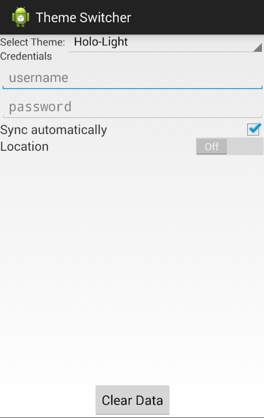
We will be defining multiple themes in our app and use a spinner view to switch between themes. By the end of this exercise, you should know how to define a theme in your resources in an XML file, how to define attributes of the theme, how to apply those to your layout file, and finally how to dynamically change the theme of an activity. Below is the final output.

File -> New Project. ThemeSwitcher (minSDK 16)Create a simple layout for our app. Later on we'll be applying all our styles and themes to this layout file.
Next, let's add the strings for our input views. Add the following to res/values/strings.xml:
<?xml version="1.0" encoding="utf-8"?>
<resources>

    <string name="app_name">Theme Switcher</string>

    <string name="settings_text_select_theme">Select Theme:</string>
    <string name="settings_text_credentials">Credentials</string>
    <string name="settings_text_username_hint">username</string>
    <string name="settings_text_password_hint">password</string>
    <string name="settings_text_sync_automatically">Sync automatically</string>
    <string name="settings_text_location">Location</string>
    <string name="settings_text_state_on">On</string>
    <string name="settings_text_state_off">Off</string>
    <string name="settings_text_clear_data">Clear Data</string>
</resources>
Let's also add to res/values/strings.xml the list of all the themes we will be allowed to choose from the spinner. Feel free to replace YOUR-CUSTOM-THEME-NAME with a theme name of your choice below.
  <string-array name="theme_array">
      <item>Material-Light</item>
      <item>YOUR-CUSTOM-THEME-NAME</item>
  </string-array>
res/layout/activity_theme.xml file and go to the xml tab. Then paste the code below.
<RelativeLayout xmlns:android="http://schemas.android.com/apk/res/android"
    xmlns:tools="http://schemas.android.com/tools"
    android:layout_width="match_parent"
    android:layout_height="match_parent" >

    <TextView
        android:id="@+id/tvSelectTheme"
        android:layout_width="wrap_content"
        android:layout_height="wrap_content"
        android:text="@string/settings_text_select_theme" />

    <Spinner
        android:id="@+id/spThemes"
        android:layout_width="wrap_content"
        android:layout_height="wrap_content"
        android:layout_alignBaseline="@+id/tvSelectTheme"
        android:layout_alignParentRight="true"
        android:layout_toRightOf="@+id/tvSelectTheme"
        android:entries="@array/theme_array"
        android:spinnerMode="dropdown" />

    <RelativeLayout
        android:id="@+id/rlCredentials"
        android:layout_width="wrap_content"
        android:layout_height="wrap_content"
        android:layout_below="@+id/tvSelectTheme" >

        <TextView
            android:id="@+id/tvCredentials"
            android:layout_width="wrap_content"
            android:layout_height="wrap_content"
            android:text="@string/settings_text_credentials" />

        <EditText
            android:id="@+id/tvUsername"
            android:layout_width="match_parent"
            android:layout_height="wrap_content"
            android:layout_below="@+id/tvCredentials"
            android:hint="@string/settings_text_username_hint"
            android:inputType="text"
            android:lines="1" />

        <EditText
            android:id="@+id/tvpassword"
            android:layout_width="match_parent"
            android:layout_height="wrap_content"
            android:layout_below="@+id/tvUsername"
            android:hint="@string/settings_text_password_hint"
            android:inputType="textPassword"
            android:lines="1" />
    </RelativeLayout>

    <TextView
        android:id="@+id/tvSync"
        android:layout_width="wrap_content"
        android:layout_height="wrap_content"
        android:layout_below="@+id/rlCredentials"
        android:text="@string/settings_text_sync_automatically"
        android:textSize="17sp" />

    <CheckBox
        android:id="@+id/checkbox_sync_automatically"
        android:layout_width="wrap_content"
        android:layout_height="wrap_content"
        android:layout_alignBaseline="@+id/tvSync"
        android:layout_alignParentRight="true"
        android:checked="true" />

    <TextView
        android:id="@+id/tvLocation"
        android:layout_width="wrap_content"
        android:layout_height="wrap_content"
        android:layout_below="@+id/tvSync"
        android:text="@string/settings_text_location"
        android:textSize="17sp" />

    <Switch
        android:id="@+id/toggle_google"
        android:layout_width="wrap_content"
        android:layout_height="wrap_content"
        android:layout_alignBaseline="@+id/tvLocation"
        android:layout_alignParentRight="true"
        android:layout_toRightOf="@+id/tvLocation"
        android:textOff="@string/settings_text_state_off"
        android:textOn="@string/settings_text_state_on" />

    <Button
        android:id="@+id/btnClearData"
        android:layout_width="wrap_content"
        android:layout_height="wrap_content"
        android:layout_alignParentBottom="true"
        android:layout_centerHorizontal="true"
        android:text="@string/settings_text_clear_data" />

</RelativeLayout>
Note that the spinner is bound to the string array and will display the theme names that we will be defining later on.
If you run your application now, you should see the following output.
There may be cases where we want to define attributes not exposed in the original theme (i.e. defining a background for this activity that can be easily changed for different themes). Similar to the interface pattern, we define these custom attributes and have each theme implement them. In this way, we can easily switch themes at runtime.
An <attr> element has two XML attributes name and format. name lets you title the attribute and this is how you refer to each in code, e.g., R.attr.my_attribute. The format attribute can have different values depending on the 'type' of attribute you want.
In this case, it is a "reference" to another attribute i.e. it references another resource id (e.g, @color/my_color, @layout/my_layout). Other examples of possible formats are pixels, color, boolean, dimension, integer, and float, string, fraction, enum and flag.
These attributes can be defined in each theme later and then applied to views on the page by adding a style property indicating the attribute to apply. We will implement this part in step 6.
Create a file called attrs.xml inside /res/values/ and add the following
<?xml version="1.0" encoding="utf-8"?>
<resources>

    <attr name="pageBackground" format="reference" />
    <attr name="textSubheader" format="reference" />
    <attr name="textLarge" format="reference" />
    <attr name="textRegular" format="reference" />
    <attr name="whiteBackground" format="reference" />
    <attr name="button" format="reference" />
    <attr name="spinner" format="reference" />

</resources>When defining paddings or text sizes, the proper pattern is to store the explicit values in a dimens.xml and then refer only to the label for those dimensions. Create a res/values/dimens.xml file which stores these dimension values:
<resources>

    <dimen name="activity_horizontal_padding">16dp</dimen>
    <dimen name="content_left_margin_wh">8sp</dimen>
    <dimen name="text_large_margin_top">40dp</dimen>
    <dimen name="text_large_text_size">18sp</dimen>
    <dimen name="text_subheader_text_size">16sp</dimen>
    <dimen name="text_regular_text_size">15sp</dimen>
    <dimen name="view_margin">20dp</dimen>
    <dimen name="white_background_padding">20dp</dimen>
    <dimen name="edittext_margin_top">10dp</dimen>
    <dimen name="spinner_margin_left">10dp</dimen>
    <dimen name="card_margin_top">40dp</dimen>

</resources>Applying attributes to views is much simpler using styles. For example, you could set the styles of all of your title TextViews to have the style textTitle. This style could have custom text color, font, and margin properties.
In addition to styles, you will be using drawables to customize your views. A drawable resource is a general concept for a graphic that can be drawn to the screen. For more information, refer the cliffnotes on drawables.
Add a folder called drawable under the res folder. Let's define the background for our first theme in res/drawable/white_gray_gradient_background.xml with a shape drawable:
<?xml version="1.0" encoding="utf-8"?>
<shape xmlns:android="http://schemas.android.com/apk/res/android" >

    <gradient
        android:angle="270"
        android:endColor="#AFAFAF"
        android:startColor="#FFFFFF" />

</shape>
Define the normal button state in res/drawable/button_wh_normal.xml:
<?xml version="1.0" encoding="utf-8"?>
<shape xmlns:android="http://schemas.android.com/apk/res/android"
    android:shape="rectangle" >

    <gradient
        android:angle="270"
        android:centerColor="#FFCECFCE"
        android:endColor="#FFBEBEBE"
        android:startColor="#FFF7F7F7" />

    <padding
        android:bottom="8dp"
        android:left="16dp"
        android:right="16dp"
        android:top="8dp" />

    <corners android:radius="48dp" />

</shape>
Define the pressed button state res/drawable/button_wh_pressed.xml:
<?xml version="1.0" encoding="utf-8"?>
<shape xmlns:android="http://schemas.android.com/apk/res/android"
    android:shape="rectangle" >

    <gradient
        android:angle="270"
        android:centerColor="#FF207FB9"
        android:endColor="#FF0060B8"
        android:startColor="#FF66CFE6" />

    <padding
        android:bottom="8dp"
        android:left="8dp"
        android:right="8dp"
        android:top="8dp" />

    <corners android:radius="48dp" />

</shape>
Define the state list for the button in res/drawable/button_wh.xml:
<?xml version="1.0" encoding="utf-8"?>
<selector xmlns:android="http://schemas.android.com/apk/res/android">

    <item android:drawable="@drawable/button_wh_pressed" android:state_pressed="true"/>
    <item android:drawable="@drawable/button_wh_normal"/>

</selector>
For the spinner, download the nine-patch file for the corner triangle. You can find all the default drawables in the Android SDK on Github or on your system at /path/to/android/sdk/platforms/<sdk-version>/data/res/drawable/spinner_default_holo_light.9.png. Copy this stretchy nine-patch graphic to your drawable folder.
Let's define the style for our spinner. First the background in res/drawable/spinner_wh_background.xml creating a selector:
<?xml version="1.0" encoding="utf-8"?>
<selector xmlns:android="http://schemas.android.com/apk/res/android"
    android:opacity="transparent" >

    <item android:state_pressed="true">
        <shape android:shape="rectangle" >
            <solid android:color="#00000000" />
        </shape>
    </item>
    <item android:state_selected="true">
        <shape android:shape="rectangle" >
            <solid android:color="#00000000" />
        </shape>
    </item>
    <item android:drawable="@drawable/spinner_default_holo_light">
    </item>

</selector>
Now we can open res/values/styles.xml file. This is where you'll define all your view styles in res/values/styles.xml:
<resources>

    <!--
        Base application theme, dependent on API level. This theme is replaced
        by AppBaseTheme from res/values-vXX/styles.xml on newer devices.
    -->
    <style name="AppBaseTheme" parent="Theme.AppCompat.Light">
        <!--
            Theme customizations available in newer API levels can go in
            res/values-vXX/styles.xml, while customizations related to
            backward-compatibility can go here.
        -->
    </style>

    <!-- Application theme. -->
    <style name="AppTheme" parent="AppBaseTheme">
        <!-- All customizations that are NOT specific to a particular API-level can go here. -->
    </style>

    <style name="switch_text_appearance" parent="@android:style/TextAppearance.Holo.Small">
        <item name="android:textColor">#FFF</item>
    </style>

    <!-- =============================================================== -->
    <!-- Material-Light styles -->
    <!-- =============================================================== -->

    <style name="page_background_wh">
        <item name="android:background">@drawable/white_gray_gradient_background</item>
        <item name="android:paddingLeft">@dimen/activity_horizontal_padding</item>
        <item name="android:paddingRight">@dimen/activity_horizontal_padding</item>
    </style>

    <style name="text_subheader_wh">
        <item name="android:textColor">#000</item>
        <item name="android:textSize">@dimen/text_subheader_text_size</item>
        <item name="android:shadowDy">1.0</item>
        <item name="android:shadowRadius">1</item>
        <item name="android:shadowColor">#000</item>
    </style>

    <style name="text_large_wh">
        <item name="android:textColor">@android:color/background_dark</item>
        <item name="android:textSize">@dimen/text_large_text_size</item>
        <item name="android:shadowDy">1.0</item>
        <item name="android:shadowRadius">1</item>
        <item name="android:shadowColor">#888</item>
        <item name="android:textStyle">bold</item>
        <item name="android:layout_marginTop">@dimen/text_large_margin_top</item>
    </style>

    <style name="text_regular_wh">
        <item name="android:textColor">@android:color/background_dark</item>
        <item name="android:textSize">@dimen/text_regular_text_size</item>
    </style>

    <style name="white_background_wh">
        <item name="android:background">@android:drawable/dialog_holo_light_frame</item>
        <item name="android:layout_marginTop">@dimen/card_margin_top</item>
        <item name="android:layout_marginBottom">@dimen/card_margin_top</item>
        <item name="android:padding">@dimen/white_background_padding</item>
    </style>

    <style name="button_wh" parent="text_large_wh">
        <item name="android:background">@drawable/button_wh</item>
        <item name="android:layout_marginTop">@dimen/view_margin</item>
    </style>

    <style name="spinner_wh">
        <item name="android:background">@drawable/spinner_wh_background</item>
    </style>

    <style name="horizontal_line_wh">
        <item name="android:background">#00000000</item>
    </style>

    <color name="actionbar_bg_wh">#AFAFAF</color>

    <style name="action_bar_wh" parent="@style/Widget.AppCompat.Light.ActionBar.Solid.Inverse">
        <item name="android:background">@color/actionbar_bg_wh</item>
        <item name="background">@color/actionbar_bg_wh</item>
    </style>

    <!-- =============================================================== -->
    <!-- Customize YOUR_CUSTOM_THEME Styles -->
    <!-- Define your own styles below. -->
    <!-- =============================================================== -->

</resources>
Above in the styles.xml is where we define the "implementation" of the style attributes we defined earlier. The attributes view properties change depending on the theme being created but the names of the attributes are the same across themes.
Note: The style white_background_wh uses this built-in nine patch dialog 9-patch image called dialog_full_holo_light.9.png to achieve the border shadow for the layout. Alternatively, you can create simpler box shadows using layer-lists.
Note: Check out more details on styling the ActionBar in order to further customize the ActionBar appearance.
themes.xml fileTo define the theme attributes we use a themes.xml file. In our theme definition, we set some custom styles using the item element. Note how the default OS attribute android:actionBarStyle has been overridden to style the action bar along with the custom attributes. For more information on styling action bar, check out styling the action bar cliffnotes.
In addition, note how we implement the custom attributes in the theme defined in step 3, such as pageBackground, textSubheader, etc. in the theme.
Add the following to res/values/themes.xml:
<?xml version="1.0" encoding="utf-8"?>
<resources xmlns:android="http://schemas.android.com/apk/res/android">

    <style name="Theme.Material_Light" parent="Theme.AppCompat.Light">
        <item name="pageBackground">@style/page_background_wh</item>
        <item name="textSubheader">@style/text_subheader_wh</item>
        <item name="textLarge">@style/text_large_wh</item>
        <item name="textRegular">@style/text_regular_wh</item>
        <item name="whiteBackground">@style/white_background_wh</item>
        <item name="button">@style/button_wh</item>
        <item name="spinner">@style/spinner_wh</item>
        <item name="actionBarStyle">@style/action_bar_wh</item>
    </style>

    <style name="Theme.YOUR_CUSTOM_THEME" parent="Theme.AppCompat.Light">
    	<!-- Define styles for YOUR_CUSTOM_THEME here. -->
    </style>

</resources>
Note that the theme simply defines the correct style references for each attribute we defined earlier. The theme acts as a "style controller" defining which styles to apply to different aspects of the view. To have multiple themes, you will want to create multiple theme definitions in themes.xml as shown in the XML above.
Update your layout file and apply the custom styles to your views. Note that the style attribute has been applied to many of the views below.
Edit res/layout/activity_theme.xml to apply the theme attributes to each item in order to apply them based on the theme:
<RelativeLayout xmlns:android="http://schemas.android.com/apk/res/android"
    xmlns:tools="http://schemas.android.com/tools"
    style="?pageBackground"
    android:layout_width="match_parent"
    android:layout_height="match_parent" >

    <TextView
        android:id="@+id/tvSelectTheme"
        style="?textLarge"
        android:layout_width="wrap_content"
        android:layout_height="wrap_content"
        android:text="@string/settings_text_select_theme" />

    <Spinner
        android:id="@+id/spThemes"
        style="?spinner"
        android:layout_width="wrap_content"
        android:layout_height="wrap_content"
        android:layout_alignBaseline="@+id/tvSelectTheme"
        android:layout_alignParentRight="true"
        android:layout_marginLeft="@dimen/spinner_margin_left"
        android:layout_toRightOf="@+id/tvSelectTheme"
        android:entries="@array/theme_array"
        android:spinnerMode="dropdown" />

    <RelativeLayout
        android:id="@+id/rlCredentials"
        style="?whiteBackground"
        android:layout_width="wrap_content"
        android:layout_height="wrap_content"
        android:layout_below="@+id/tvSelectTheme" >

        <TextView
            android:id="@+id/tvCredentials"
            style="?textSubheader"
            android:layout_width="wrap_content"
            android:layout_height="wrap_content"
            android:text="@string/settings_text_credentials" />

        <EditText
            android:id="@+id/tvUsername"
            style="?textRegular"
            android:layout_width="match_parent"
            android:layout_height="wrap_content"
            android:layout_below="@+id/tvCredentials"
            android:hint="@string/settings_text_username_hint"
            android:inputType="text"
            android:lines="1" />

        <EditText
            android:id="@+id/tvpassword"
            style="?textRegular"
            android:layout_width="match_parent"
            android:layout_height="wrap_content"
            android:layout_below="@+id/tvUsername"
            android:layout_marginTop="@dimen/edittext_margin_top"
            android:hint="@string/settings_text_password_hint"
            android:inputType="textPassword"
            android:lines="1" />
    </RelativeLayout>

    <TextView
        android:id="@+id/tvSync"
        style="?textRegular"
        android:layout_width="wrap_content"
        android:layout_height="wrap_content"
        android:layout_below="@+id/rlCredentials"
        android:text="@string/settings_text_sync_automatically"
        android:textSize="17sp" />

    <CheckBox
        android:id="@+id/checkbox_sync_automatically"
        android:layout_width="wrap_content"
        android:layout_height="wrap_content"
        android:layout_alignBaseline="@+id/tvSync"
        android:layout_alignParentRight="true"
        android:checked="true" />

    <TextView
        android:id="@+id/tvLocation"
        style="?textRegular"
        android:layout_width="wrap_content"
        android:layout_height="wrap_content"
        android:layout_below="@+id/tvSync"
        android:layout_marginTop="@dimen/view_margin"
        android:text="@string/settings_text_location"
        android:textSize="17sp" />

    <Switch
        android:id="@+id/toggle_google"
        android:layout_width="wrap_content"
        android:layout_height="wrap_content"
        android:layout_alignBaseline="@+id/tvLocation"
        android:layout_alignParentRight="true"
        android:layout_toRightOf="@+id/tvLocation"
        android:switchTextAppearance="@style/switch_text_appearance"
        android:textOff="@string/settings_text_state_off"
        android:textOn="@string/settings_text_state_on" />

    <Button
        android:id="@+id/btnClearData"
        style="?button"
        android:layout_width="wrap_content"
        android:layout_height="wrap_content"
        android:layout_alignParentBottom="true"
        android:layout_centerHorizontal="true"
        android:layout_marginBottom="@dimen/view_margin"
        android:text="@string/settings_text_clear_data" />

</RelativeLayout>
Note that the `style="?somethemeattr" is the syntax for a reference to a resource value in the currently applied theme.
We can set the theme of our application or individual activities in the manifest file when we are not dealing with multiple themes. But for our app, since we are dynamically changing the theme from the spinner we'll have to do this programatically. This is done by calling setTheme() in the activity's onCreate() method, before any call to setContentView(). To change the theme, you simply need to restart your activity.
ThemeApplication.java:
public class ThemeApplication extends Application {
    // App level variable to retain selected spinner value
    public static int currentPosition;
}Utils.java:
public class Utils {
	private static int sTheme;

	public final static int THEME_MATERIAL_LIGHT = 0;
	public final static int THEME_YOUR_CUSTOM_THEME = 1;

	public static void changeToTheme(Activity activity, int theme) {
		sTheme = theme;
		activity.finish();
		activity.startActivity(new Intent(activity, activity.getClass()));
		activity.overridePendingTransition(android.R.anim.fade_in,
				android.R.anim.fade_out);
	}

	public static void onActivityCreateSetTheme(Activity activity) {
		switch (sTheme) {
		default:
		case THEME_MATERIAL_LIGHT:
			activity.setTheme(R.style.Theme_Material_Light);
			break;
		case THEME_YOUR_CUSTOM_THEME:
			activity.setTheme(R.style.Theme_YOUR_CUSTOM_THEME);
			break;
		}
	}
}
Now in the ThemeActivity.java to enable custom themes being applied:
public class ThemeActivity extends AppCompatActivity {
	private Spinner spThemes;

	// Here we set the theme for the activity
	// Note `Utils.onActivityCreateSetTheme` must be called before `setContentView`
	@Override
	protected void onCreate(Bundle savedInstanceState) {
		super.onCreate(savedInstanceState);
		// MUST BE SET BEFORE setContentView
		Utils.onActivityCreateSetTheme(this);
		// AFTER SETTING THEME
		setContentView(R.layout.activity_theme);
		setupSpinnerItemSelection();
	}

	private void setupSpinnerItemSelection() {
		spThemes = (Spinner) findViewById(R.id.spThemes);
		spThemes.setSelection(ThemeApplication.currentPosition);
		ThemeApplication.currentPosition = spThemes.getSelectedItemPosition();

		spThemes.setOnItemSelectedListener(new AdapterView.OnItemSelectedListener() {

			@Override
			public void onItemSelected(AdapterView<?> parent, View view,
					int position, long id) {
				if (ThemeApplication.currentPosition != position) {
					Utils.changeToTheme(ThemeActivity.this, position);
				}
				ThemeApplication.currentPosition = position;
			}

			@Override
			public void onNothingSelected(AdapterView<?> parent) {

			}
		});

	}
}
If you run your app at this point, you should have applied the styles for 'Material-Light' theme. It is now up to the reader to define the styles and drawables for your own custom theme.
